
Where Colour Finds Its Calm: Inside Jotun’s “Soulful Spaces”
Home is no longer just where we sleep, snack, and scroll. It’s where we regulate our minds, reconnect with ourselves, and shape the atmosphere we want to live in. With its 2026 Global Colour Collection, Jotun is nudging Malaysians to think beyond paint charts and see their walls as emotional architecture. The theme: SOULFUL SPACES, a celebration of colour as a creative medium and the home as its canvas.
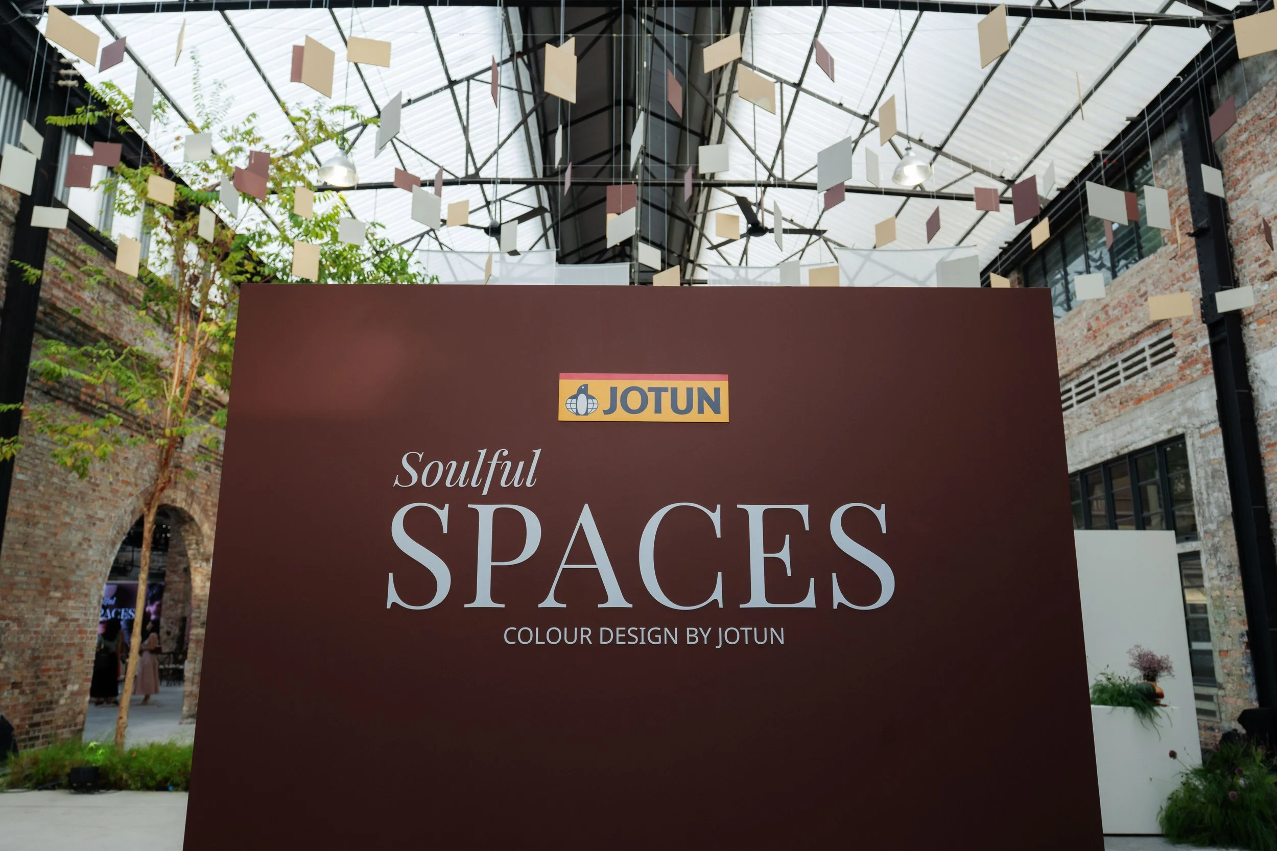
The collection was unveiled at an intimate media showcase at The Yard, Sentul Depot. Instead of a typical launch setup, guests stepped into curated colour-driven rooms designed around reflection, heritage, and joy. These immersive environments showed how drastically a shade can shift a mood, soften a room, or spark connection. It wasn’t just décor. It was emotional design in real time.

At its core, Soulful Spaces asks people to tune into the feeling they want their homes to hold. Your colours should echo your memories, your pace, your rituals. And instead of dictating trends, Jotun offers palettes that slip easily into existing homes, enhancing and harmonising rather than overwhelming.
As Natrah Omar, Colour Marketing Manager for Jotun Southeast Asia & Pacific, puts it: “Choosing colours for your home doesn’t have to be intimidating. Like all acts of creativity, the process should be a joy. With this year’s Global Colour Collection, we’ve set out to give people the knowledge and confidence to find the perfect personal colour expression for their homes, allowing them to shape a space that lifts their heart and tells their unique story.”
Three Styles. Infinite Stories. One Seamless Flow.
Soulful Spaces is built around the idea that homes evolve with us. The colours are muted, warm, and grounded by golden undertones, making them easy to blend from one room to the next. Whether used solo or layered in a full-house palette, the tones complement each other and create a sense of visual continuity.
The collection unfolds across three themes, each designed to spark its own emotional rhythm.
Passage of Time — Quiet. Refined. Soulful.
If you’re drawn to the charm of storied spaces or hues that carry a sense of depth, Passage of Time is your palette. Think deep greens, rich reds, and earthy browns lifted by golden pinks and soft sheen. They build rooms that feel warm, elegant, and lived in.
This palette enhances the home’s narrative rather than competing with it. The colours add depth without heaviness and age gracefully as the years roll by. It’s about authenticity, not perfection — timelessness shaped by patina and presence.
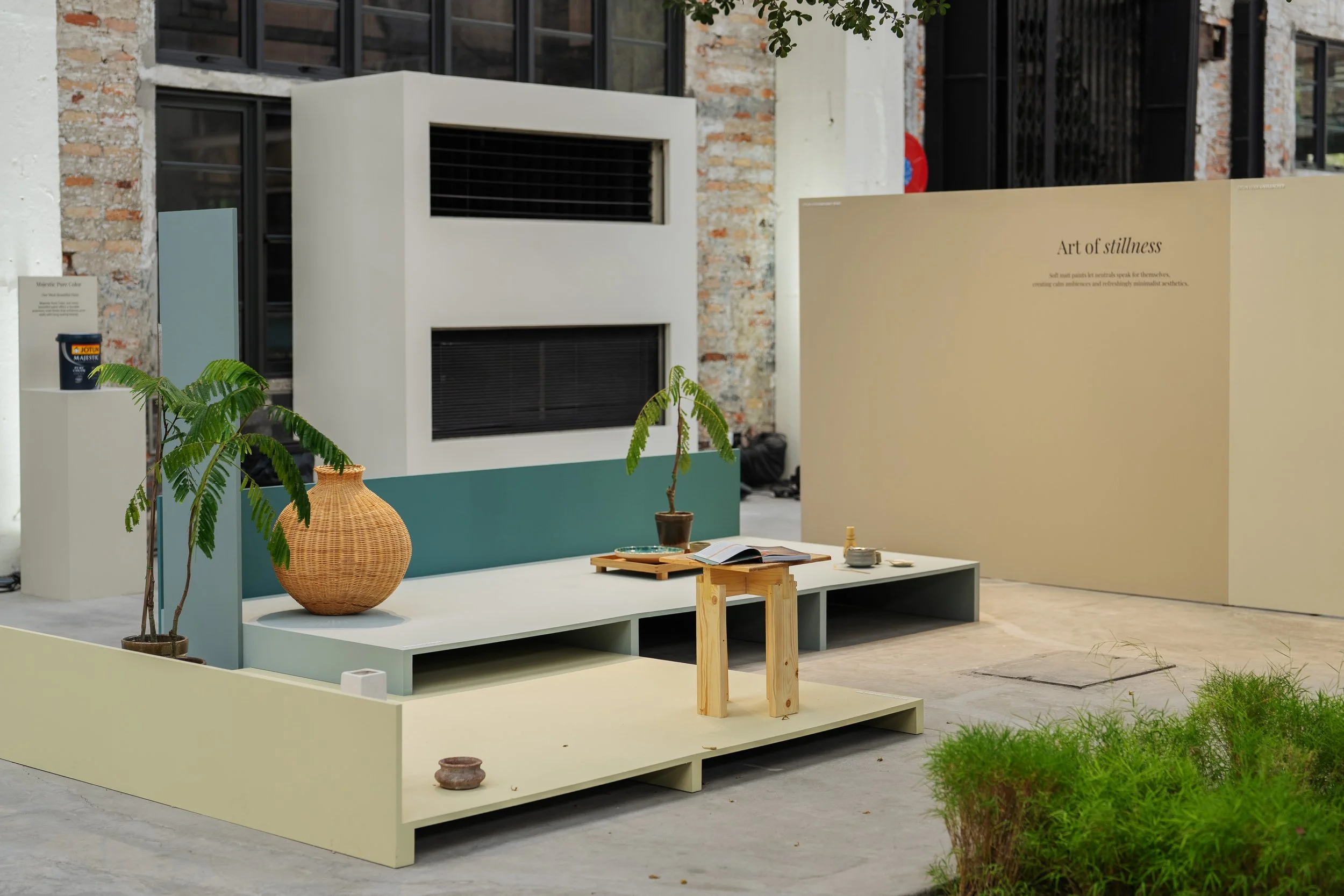
Art of Stillness — Soft. Serene. Mindful.
Art of Stillness is an antidote to modern noise. This palette borrows from nature’s gentlest tones: soft beiges, creamy yellows, and calm blue-greens. Together, they bring an airy tranquility that’s perfect for bedrooms, reading zones, or any corner meant for pause.
These colours create an unspoken hush in a space. They carve out room for reflection, for rest, for the kind of quiet that feels like a deep breath. Thoughtfully applied, they turn homes into mindful sanctuaries where calm becomes part of the daily rhythm.
Joyful Living — Bright. Buoyant. Life-giving.
Joyful Living celebrates the outdoors and the warmth of everyday pleasures. Leafy greens, soothing pinks, and golden ochres pair rustic charm with modern freshness, making them ideal for open spaces and sunlit rooms.
Stepping into a Joyful Living space feels like stepping into sunshine. These colours energise, uplift, and invite connection. They turn ordinary moments — breakfast, conversations, slow afternoons — into scenes coloured with optimism.
The Science of Beautiful Walls: Majestic Pure Colour

Colour may ignite emotion, but Jotun backs it with tech that ensures it stays as beautiful as day one. Majestic Pure Color is the brand’s premium interior paint, known for its super matt, anti-reflective finish that softens glare and keeps every tone true, regardless of lighting.
The best part: it’s as resilient as it is elegant. Life happens — fingerprints, scuffs, accidental smudges — but its washable formula keeps walls pristine with minimal effort. With this foundation, Soulful Spaces shades appear richer, smoother, and deeply natural.
Heng Ke Wei, Marketing Manager for Jotun Malaysia & Singapore, sums up the brand’s philosophy: “At Jotun, we believe that beautiful homes are built on lasting choices. With Majestic Pure Color and the Soulful Spaces collection, we’re offering Malaysians not just colour, but craftsmanship, helping them design interiors that stand the test of time, both aesthetically and functionally.”
To explore the full range and discover your personal palette, visit Jotun’s website. Your next chapter of colour might be a shade away.